Component Templates
- What are Component Templates?
- Component Template Architecture
- Creating Component Templates
- Reference: cms-component-config
- Reference: HTML Tags
- Reference: Render Functions
- Reference: Render Variables
- Reference: Page Editor Hooks
- Examples: Content Components
- Examples: Page Components
- Examples: Site Components
What are Component Templates?
Component Templates are the definition files for Components. There are three types of Components:
- Content Components
Components that can be added to editable content areas in pages, for example: Banners and Slideshows. - Page Components
Components that are added to the static areas in pages, for example: Menus and Sidebars. - Site Components
Components that are used to create system files on publish, for example: XML Sitemaps and Router Integrations.
Content Components
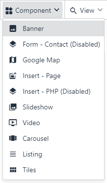
Content Components can be added to an editable area by clicking the "Component" button in the toolbar:
Content Components can be configured through:
Component Data, which can be either a single item, or a list of multiple items
Component Properties
Both Component Data and Component Properties fields are customizable and defined per-component.
Selecting a Component will bring up the "Edit Content" and "Configure" buttons:
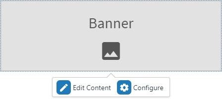
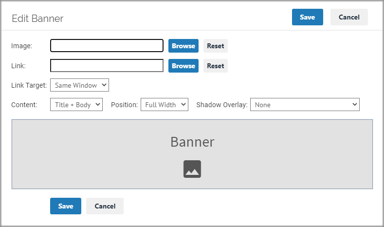
Click "Edit Content" to edit the Component Data:
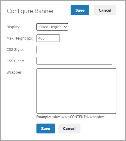
Click "Configure" to edit the Component Properties:
Multiple Data Items
A component can be enabled to support multiple data items by setting the Component Config "multiple_items" property to true.
If a component supports multiple data items, it will show a listing when you click "Edit Content":
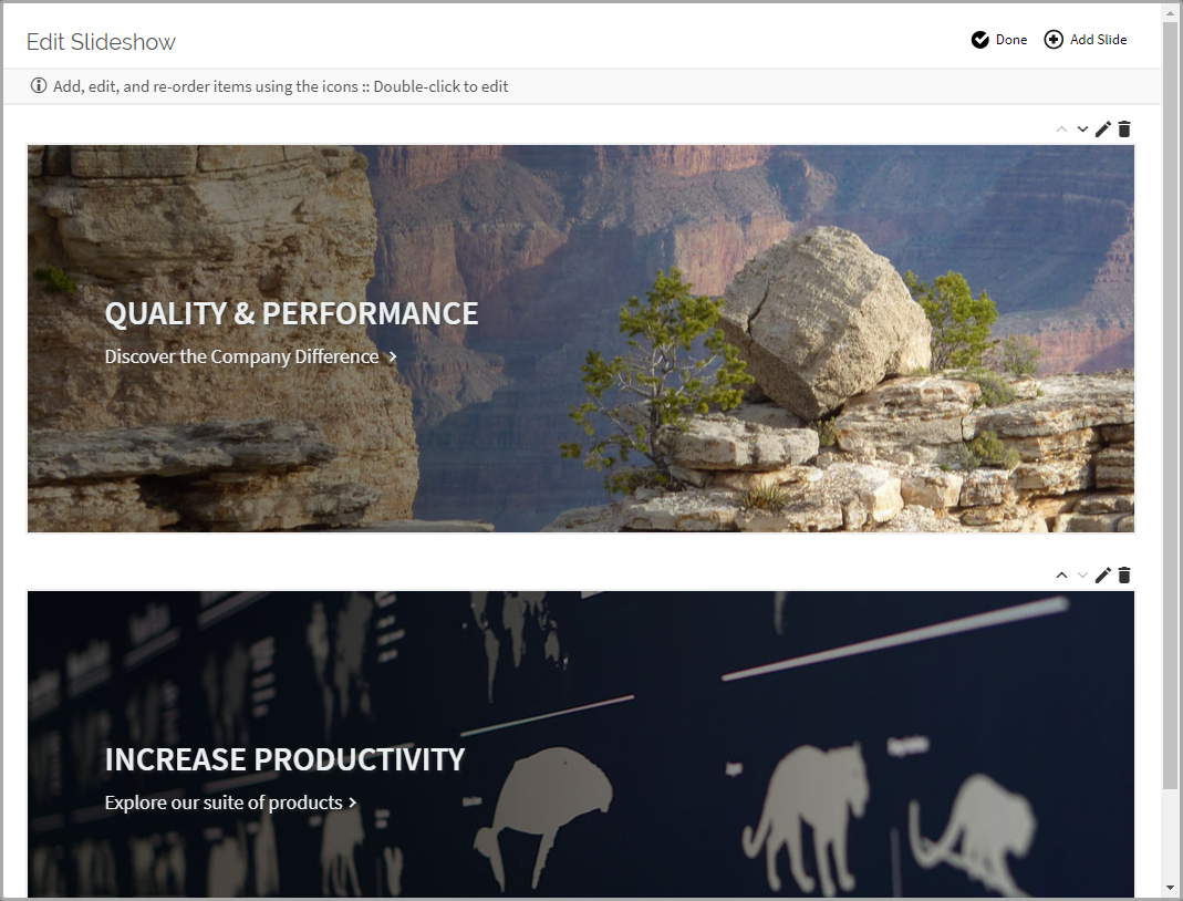
Then, you can add, delete, or re-order from the list, or select an item to edit:
Page Components
Page Components are a powerful way to add dynamic, reusable HTML to the page templates.
Page Components can be used to add elements like Menus, Sidebars, and Breadcrumbs to Page Templates.
In order to use Page Components, first copy them into the "templates/components" folder.
Next, use the Page Components in the Page Template HTML:
<div cms-component="sidebar"></div>In the example above, a component named "sidebar.html" will be rendered in the Page Template:

Once added, Page Components are rendered in both the Editor Preview and on Publish.
Content Components can also be used as Page Components, and its Component Data and Component Properties can be passed to the component through HTML attributes.
More information about adding CMS Components to Page Templates can be found in the Page Template HTML Tags reference.
Site Components
Site Components are used to export system files on publish. For example, Site Components can be used to export an XML Sitemap on publish, or to generate a ".htaccess" file with redirects.
Site Components are a great tool for integrating with existing web applications, since they can generate a router file on publish.
Site Components can be used by just copying them into the "templates/components" folder.
In practice, there is no difference between Site Components and Page Components - both can be used interchangeably. The distinction is primarily for organizing components.
Component Template Architecture
Component Templates can be rendered in four different parts of the system:
- Page Editor
WYSIWYG preview of the component in the Page Editor - Page Editor - Edit Component Data
WYSIWYG preview of the component, when editing an individual Component Data Item. The preview is refreshed as each field is changed. Editable content areas can be edited directly in the preview. - Page Editor - Component Data Listing (for components with multiple data items)
For components with multiple data items, a WYSIWYG preview of each item is displayed in the list when you double-click on the component. - Publishing
Components in pages are converted into HTML during publish. Site Components can also be used to export additional files on publish.
Content Components are rendered in all four ways listed above. Page Components are only rendered in the Page Editor and on Publish. Site Components are only rendered on Publish.
When designing Component Templates, the component should be tested in all four views, in all target resolutions, to ensure that it renders as expected.
Local Component Templates
In the standard workflow, local components are defined per-site in the site's static files SFTP. The SFTP Location is listed in the Components tab:
- Open the "Sites" tab
- Click "Configure Site" on the target site
- Select the "Components" tab
The static files are merged with the page content on publish, and everything is sent together to the deployment target.
All the site's template-related files, such as images, CSS, and JavaScript should be placed in the SFTP folder. Below are the reserved files / folders for templates:
| /templates/pages/* | Page Templates |
| /templates/components/* | Component Templates |
| /templates/websnippets/* | Web Snippets |
| /templates/site_config.json | Site Config |
Component Templates can be grouped into subfolders. If using subfolders, Page Components will need to include the subfolder in the "cms-component" attribute. For example, if the full path to the component is "/templates/components/menus/main.sidebar.html", the "cms-component" attribute would be:
<div cms-component="menus/main.sidebar"></div>Remote Component Templates
Templates can also be completely hosted in a remote server. This can help with CMS integration into existing web applications.
Enter the URL of the Remote template under the Site "Components" tab. Additional cms-component-config JSON properties can be defined by clicking the edit button under the Config column.
Component Template Files
Most components will be defined by only one file - the "component_name.html" Render Template. The Render Template file should contain a "cms-component-config" tag with the Component Config.
Advanced Component Templates can consist of the following additional files:
| component_name.html | Component Render Template |
| component_name.css | (Optional) CSS added when component is rendered by Page Editor |
| component_name.js | (Optional) JS executed when component is rendered by Page Editor |
| component_name.templates.editor.ejs | (Optional) Component Render Template (Page Editor only) |
| component_name.templates.publish.ejs | (Optional) Component Render Template (Publish only) |
| component_name.properties.ejs | (Optional) HTML added to top of Component Properties form |
| component_name.properties.css | (Optional) CSS added when Component Properties form is rendered |
| component_name.properties.js | (Optional) JS executed when Component Properties form is rendered |
| component_name.data.ejs | (Optional) HTML added to top of the Component Data form / grid |
| component_name.data.css | (Optional) CSS added when Component Data form / grid is rendered |
| component_name.data.js | (Optional) JS executed when Component Data form / grid is rendered |
Components can also be defined inline in pages, using script tags. More information about In-Page Component Template Definition can be found in the Page Template HTML Tags reference.
The Properties and Data forms use the jsHarmony framework for rendering the forms. The Properties form is defined as a Form Model, and the Data is defined as only a Form Model if there is one data item, or both a Grid and a Form if the component supports multiple data items.
To create advanced components, explore the jsHarmony Tutorials for more information on how to define Models and Fields.
Parts of a Component Template
Generally, a component template consists of the Config (cms-component-config) and the Render Template. The Render Template can use Render Functions, Render Variables, and Page Editor Hooks to render the component.
Render Template
The Render Template is the actual HTML that will be rendered by the Component. A variety of HTML and EJS extensions are available to make Component Templates easier to render.
Learn more about the Component HTML Tags in the HTML Tag Reference.
Config (cms-component-config)
The Component Config defines properties such as the template name, icon, Component Properties fields, and Component Data fields. The Config is defined as a JSON script, and is usually included at the top of the Render Template. Learn more about the Component Config in the cms-component-config Reference.
Render Functions
Render Functions are EJS functions that can be used in the Render Template. Learn more about Render Functions in the Render Functions Reference.
Render Variables
Render Variables are CMS variables, such as "menu" and "sitemap", that can be used in the Render Template. Learn more about Render Variables in the Render Variables Reference.
Page Editor Hooks
Page Editor Hooks are JavaScript event hooks that can be used in the Page Editor. The Page Editor Hooks can help in making sure that components work well in the Page Editor preview, for example when handling a Slideshow preview, or making sure the Google Map is properly instantiated. Learn more about Page Editor Hooks in the Page Editor Hooks Reference.
Creating Component Templates
Watch the Getting Started videos for a tutorial on creating component templates.
The easiest way to create a component is to start with an Example component (links to examples on top of this page) or with a component from an existing theme, copy the component, and make changes as necessary.
You can also create new Component Templates as follows:
Creating Content Components
1. Start by designing the component as HTML element in an existing Page Template:
<div class="banner" style="background-image:url('/images/banner.jpg');">
  <h1>Title</h1>
  <div class="banner_body">Body Text</div>
</div>
Be sure all URLs are root-relative (starting with a "/").
For example, use: "/images/banner.jpg"
Do not use: "images/banner.jpg" or "../images/banner.jpg"
2. Open the Page Template in Developer mode, by going to "Edit Site", "Page Templates", and click "Preview" on the template. Make sure it looks good at different browser widths.
3. Move the component's HTML into a new In-Page Component, by wrapping it in a "text/cms-component-template" script tag:
<script type="text/cms-component-template">
  <div class="banner" style="background-image:url('/images/sample_banner.jpg');">
    <h1>Title</h1>
    <div class="banner_body">Body Text</div>
  </div>
</script>
4. Add a "cms-component-config" section to the In-Page Component. Set the "id", "title", "target", "multiple_items", and "icon" properties:
<script type="text/cms-component-template">
  <cms-component-config>
  {
    "id": "banner",
    "title": "Banner",
    "target": "content",
    "icon": "material:view_module",
    "multiple_items": false
  }
  </cms-component-config>
  <div class="banner" style="background-image:url('/images/sample_banner.jpg');">
    <h1>Title</h1>
    <div class="banner_body">Body Text</div>
  </div>
</script>
5. Define Component Properties and Component Data in the cms-component-config, if necessary:
<script type="text/cms-component-template">
<cms-component-config>
{
"id": "banner",
"title": "Banner",
"target": "content",
"icon": "material:view_module",
"multiple_items": false,
"component_properties": [
{ "name": "cssStyle", "caption": "CSS Style" },
{ "name": "cssClass", "caption": "CSS Class" },
],
"item_properties": [
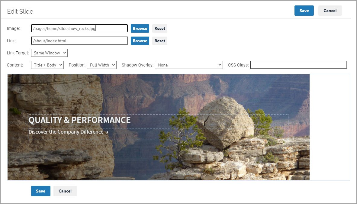
{ "name": "image", "caption": "Image", "control": "media_browser", "validate": ["Required"]},
{ "name": "title", "control": "htmleditor" },
{ "name": "body", "control": "htmleditor" },
]
}
</cms-component-config>
<div class="banner" style="background-image:url('/images/sample_banner.jpg');">
<h1>Title</h1>
<div class="banner_body">Body Text</div>
</div>
</script>6. Add EJS and HTML Render Tags to the component HTML to use the Component Properties and Component Data:
<script type="text/cms-component-template">
  <cms-component-config>
  {
    "id": "banner",
    "title": "Banner",
    "target": "content",
    "icon": "material:view_module",
    "multiple_items": false,
    "component_properties": [
      { "name": "cssStyle", "caption": "CSS Style" },
      { "name": "cssClass", "caption": "CSS Class" },
    ],
    "item_properties": [
      { "name": "image", "caption": "Image", "control": "media_browser", "validate": ["Required"]},
      { "name": "title", "control": "htmleditor" },
      { "name": "body", "control": "htmleditor" },
    ]
  }
  </cms-component-config>
  <div class="banner <%=component.cssClass%>" style="background-image:url(<%=JSON.stringify(item.image)%>); <%=component.cssStyle%>">
    <h1 cms-content-editor="item.title">Title</h1>
    <div class="banner_body" cms-content-editor="item.body">Body Text</div>
  </div>
</script>
7. Test by refreshing the Page Template in Developer mode and adding the component into an editable content area.
8. Move the Component into its own file in the "templates/components" folder when done (example below).
* The "text/cms-component-template" script wrapper should be removed when the component has its own file
* The "id" Config property can also be removed, because it is automatically set based on the component file name
<!-- New file: /templates/components/banner.html -->
<cms-component-config>
{
  "title": "Banner",
  "target": "content",
  "icon": "material:view_module",
  "multiple_items": false,
  "component_properties": [
    { "name": "cssStyle", "caption": "CSS Style" },
    { "name": "cssClass", "caption": "CSS Class" },
  ],
  "item_properties": [
    { "name": "image", "caption": "Image", "control": "media_browser", "validate": ["Required"]},
    { "name": "title", "control": "htmleditor" },
    { "name": "body", "control": "htmleditor" },
  ]
}
</cms-component-config>
<div class="banner <%=component.cssClass%>" style="background-image:url(<%=JSON.stringify(item.image)%>); <%=component.cssStyle%>">
  <h1 cms-content-editor="item.title">Title</h1>
  <div class="banner_body" cms-content-editor="item.body">Body Text</div>
</div>
Creating Page Components
1. Start by designing the component as HTML in an existing Page Template:
<ul class="topmenu">
  <li><a href="#">Home</a></li>
  <li><a href="#">About</a></li>
  <li><a href="#">Contact</a></li>
</ul>
2. Open the Page Template in Developer mode, by going to "Edit Site", "Page Templates", and click "Preview" on the template. Make sure it looks good at different browser widths.
3. Move the component's HTML into a new In-Page Component, by wrapping it in a "text/cms-component-template" script tag:
<script type="text/cms-component-template">
  <ul class="topmenu">
    <li><a href="#">Home</a></li>
    <li><a href="#">About</a></li>
    <li><a href="#">Contact</a></li>
  </ul>
</script>
4. Add a "cms-component-config" section to the In-Page Component. Set the "id" and "target" properties:
<script type="text/cms-component-template">
  <cms-component-config>
  {
    "id": "topmenu",
    "target": "page"
  }
  </cms-component-config>
  <ul class="topmenu">
    <li><a href="#">Home</a></li>
    <li><a href="#">About</a></li>
    <li><a href="#">Contact</a></li>
  </ul>
</script>
5. Add an instance of the component into the Page Template, to preview how the component will look.
* In this example, the component renders a menu, so we will also need to define a menu with a tag of "mainmenu" in the Menus tab, and add the "cms-menu-tag" attribute to the component instance:
<div cms-component="topmenu" cms-menu-tag="mainmenu"></div>6. Add EJS and HTML Render Tags to the component template HTML, as necessary, to render the component dynamically based on Render Variables:
<script type="text/cms-component-template">
  <cms-component-config>
  {
    "id": "topmenu",
    "target": "page"
  }
  </cms-component-config>
  <ul class="topmenu">
    <li jsh-foreach-item="menu.topItems"><a href="<%~item.href%>" onclick="<%~item.onclick%>" target="<%~item.target%>"><%-item.html%></a></li>
  </ul>
</script>
7. Test by refreshing the Page Template in Developer mode.
8. Move the Component into its own file in the "templates/components" folder when done (example below).
* The "text/cms-component-template" script wrapper should be removed when the component has its own file
* The "id" Config property can also be removed, because it is automatically set based on the component file name
<!-- New file: /templates/components/topmenu.html -->
<cms-component-config>
{
  "target": "page"
}
</cms-component-config>
<ul class="topmenu">
  <li jsh-foreach-item="menu.topItems"><a href="<%~item.href%>" onclick="<%~item.onclick%>" target="<%~item.target%>"><%-item.html%></a></li>
</ul>
Creating Site Components
1. Create a new file for the Site Component in the "templates/components" folder:
<!-- New file: /templates/components/sitemap.html -->2. Add a "cms-component-config" section to the Component. Set the "target" property:
<script type="text/cms-component-config">
  {
    "target": "site"
  }
</script>
3. Add an "export" property to the component:
<script type="text/cms-component-config">
  {
    "target": "site",
    "export": [
      { "export_path": "sitemap.xml" }
    ]
  }
</script>
4. Use EJS and the Component Render Tags, Render Functions, and Render Variables to generate the file that will be saved to the export path:
<?xml version="1.0" encoding="UTF-8"?>
<script type="text/cms-component-config">
  {
    "target": "site",
    "export": [
      { "export_path": "sitemap.xml" }
    ]
  }
</script>
<urlset  xmlns="http://www.sitemaps.org/schemas/sitemap/0.9">
<url jsh-foreach-item="_.filter(sitemap.allItems, function(item){ return item.sitemap_item_link_type=='PAGE'; })">
  <loc><%=publish_params.published_url%><%=getSitemapURL(item)%></loc>
  <lastmod><%=(new Date().toISOString())%></lastmod>
  <changefreq>hourly</changefreq>
  <priority>0.5</priority>
</url>
</urlset>
5. Publish to test and make sure the export file was created successfully.
